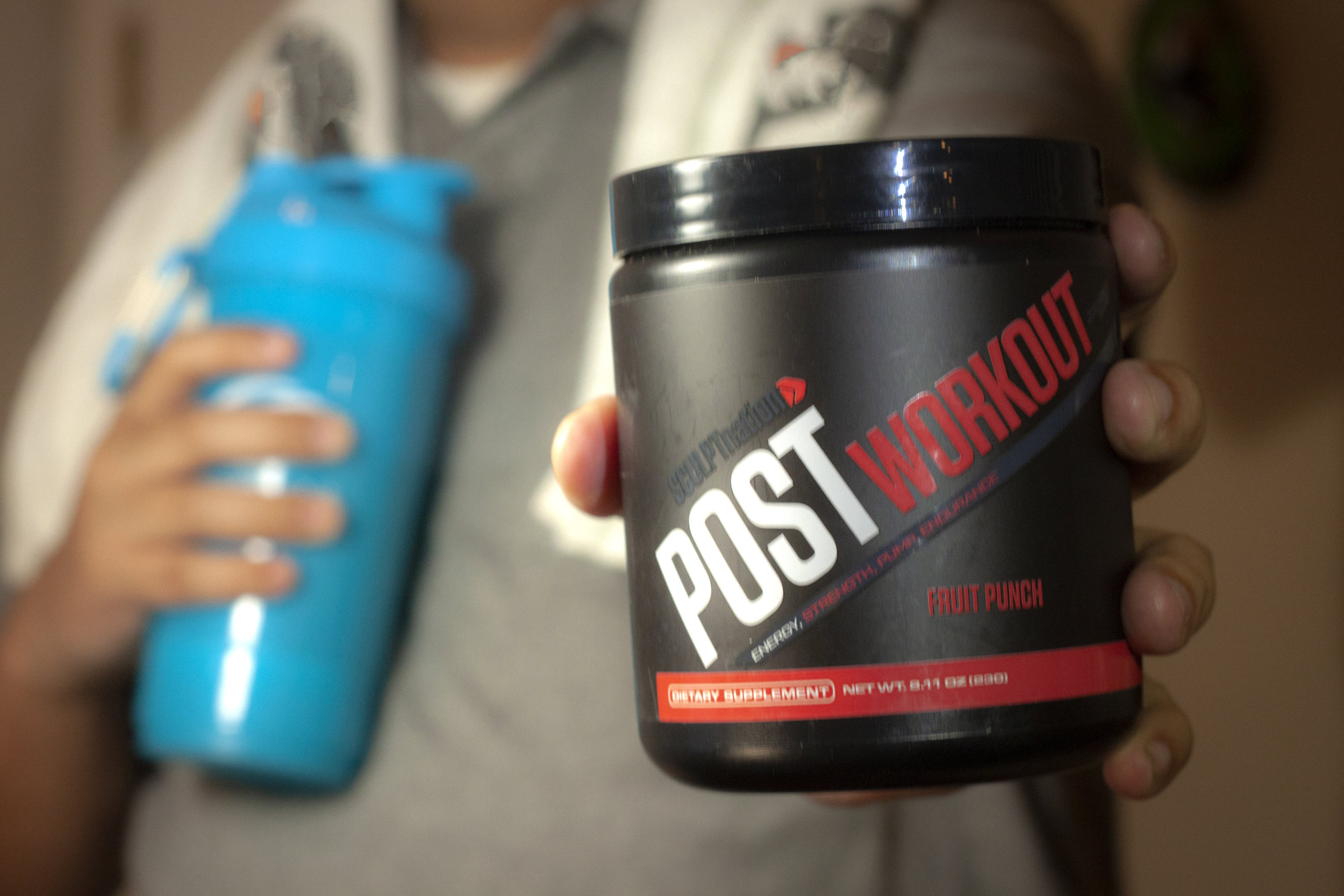
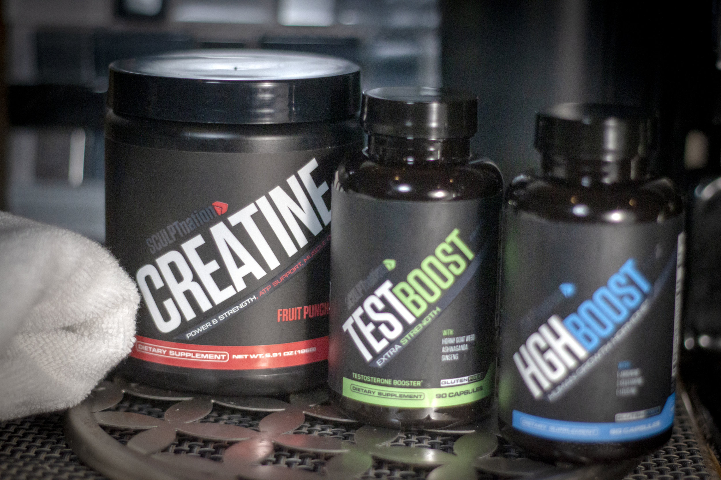
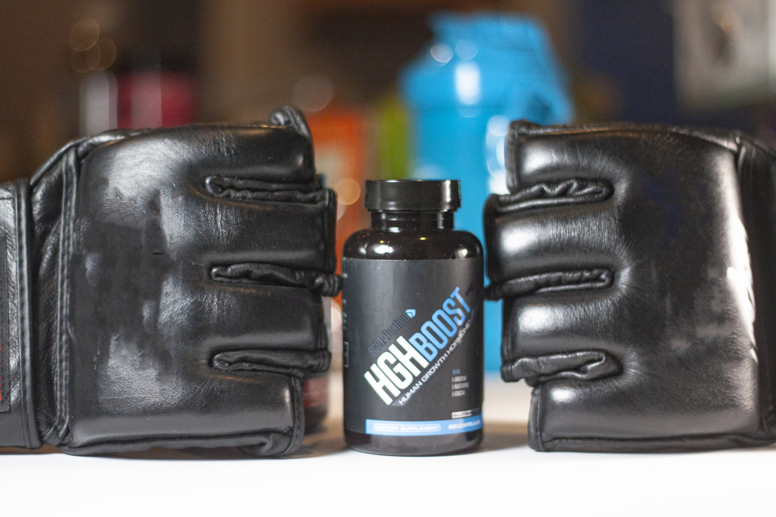
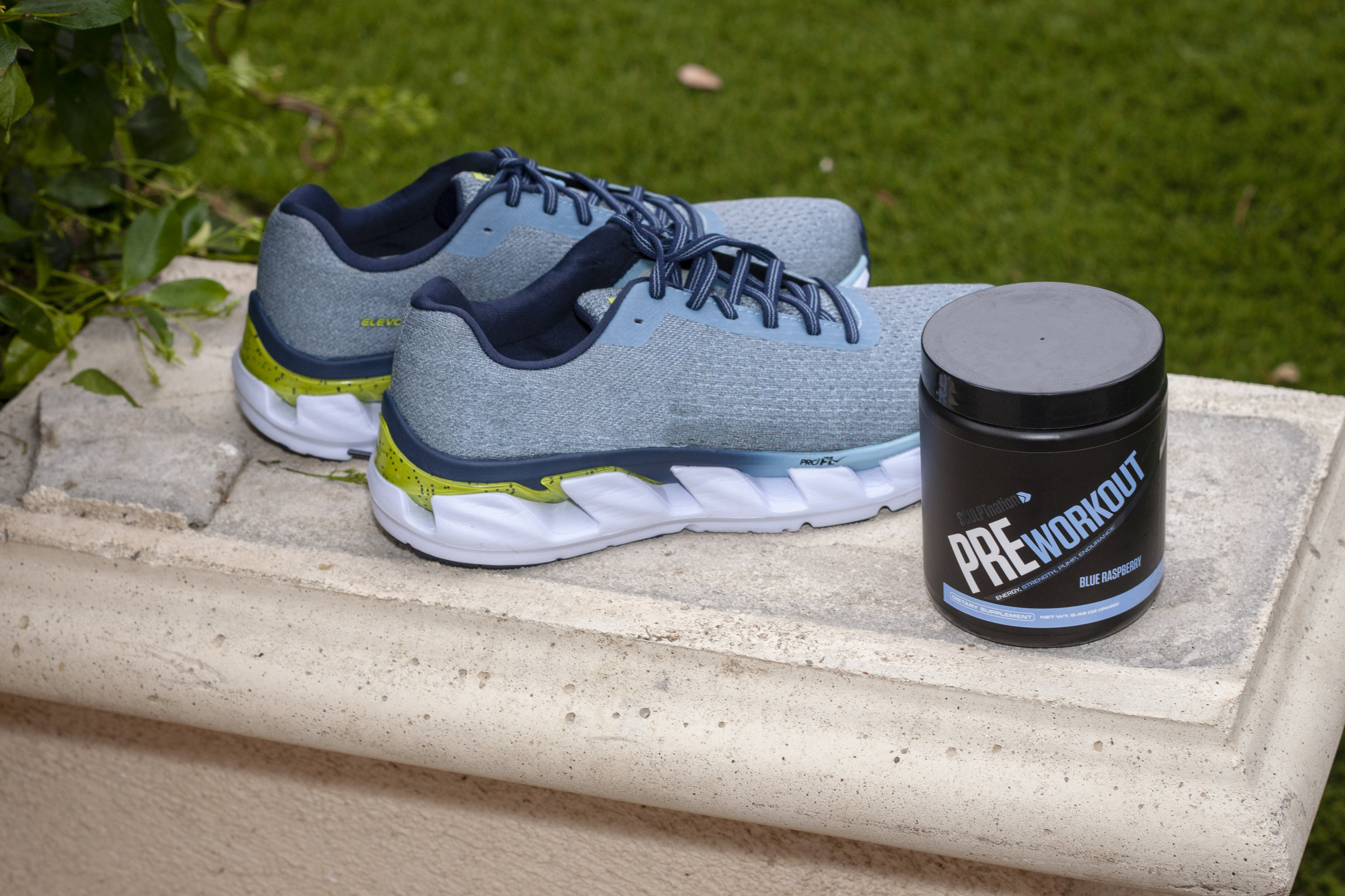
Product Images
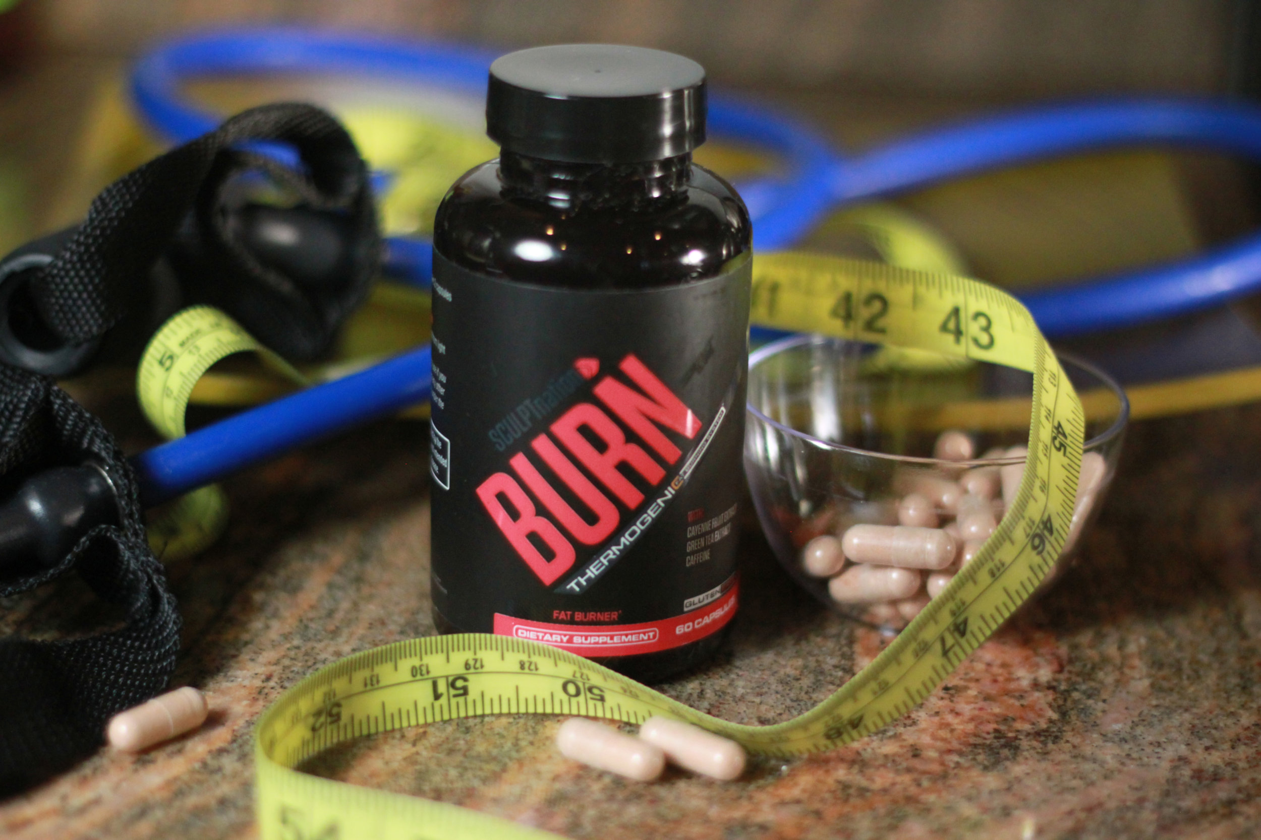
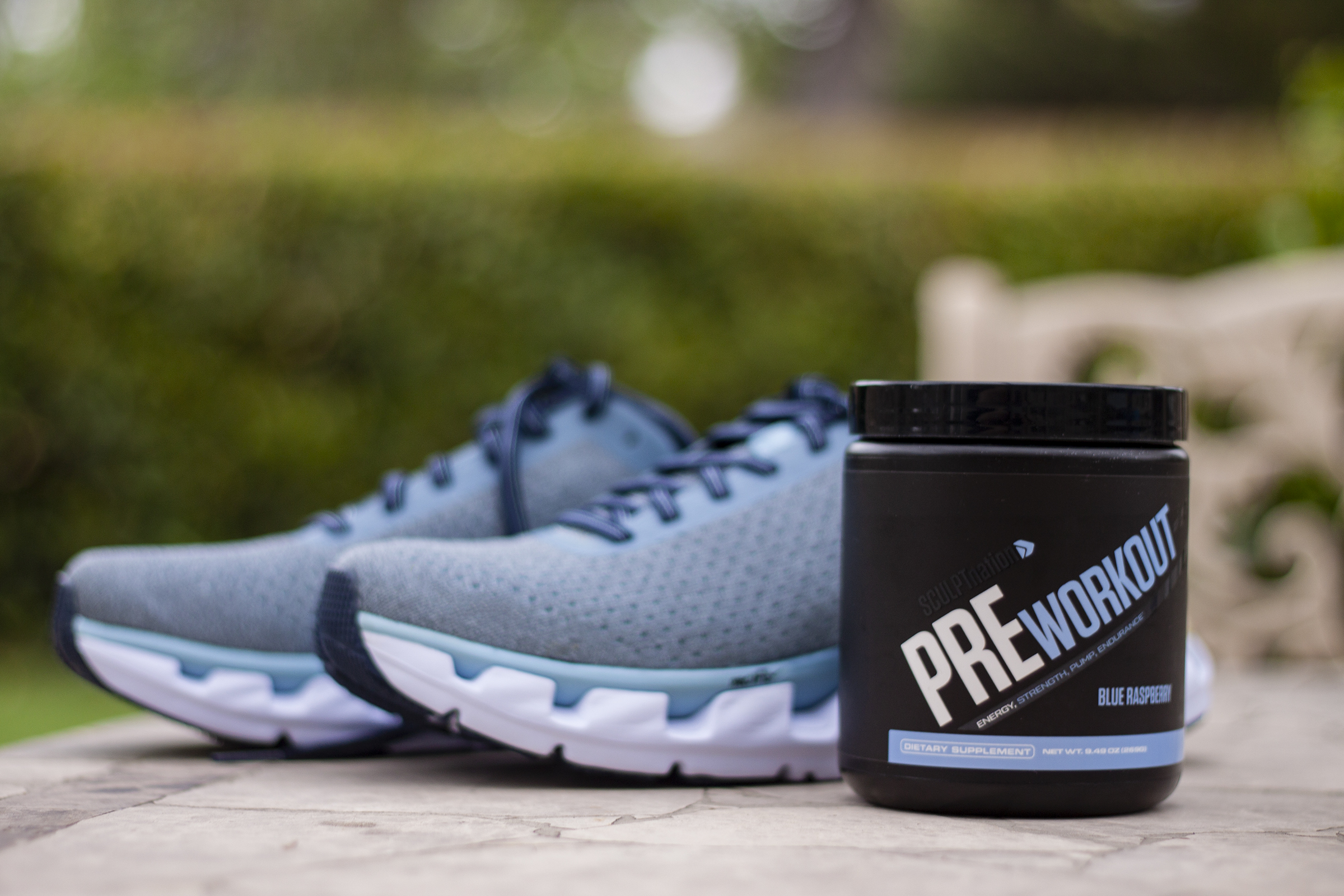
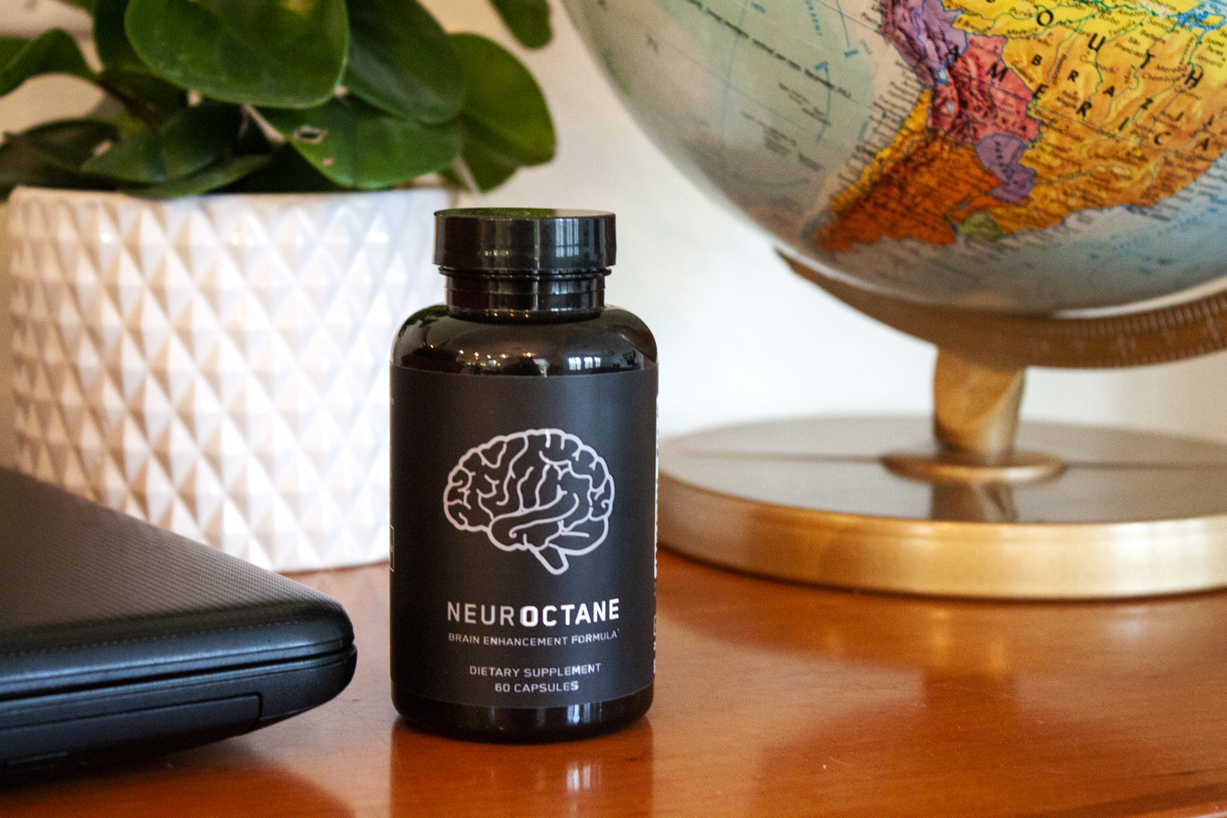
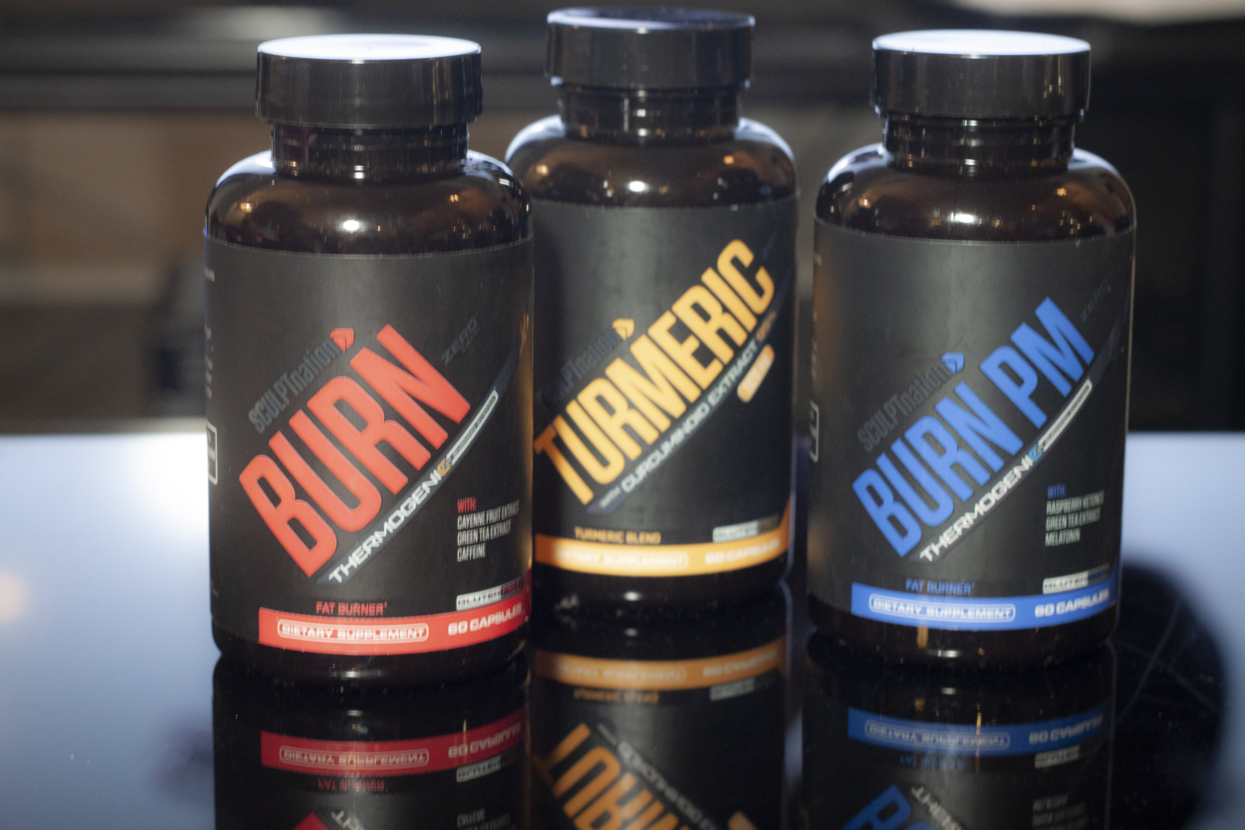
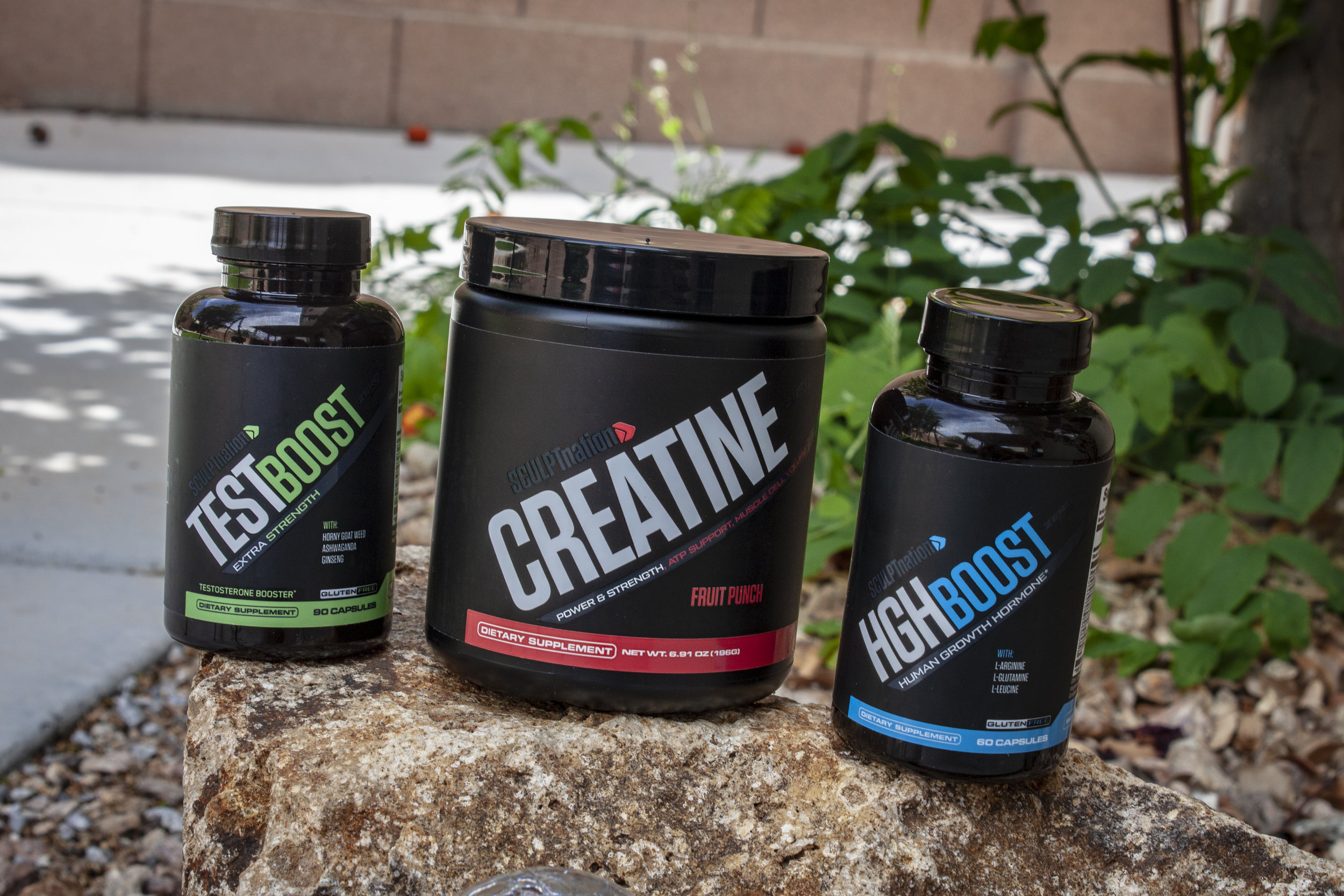
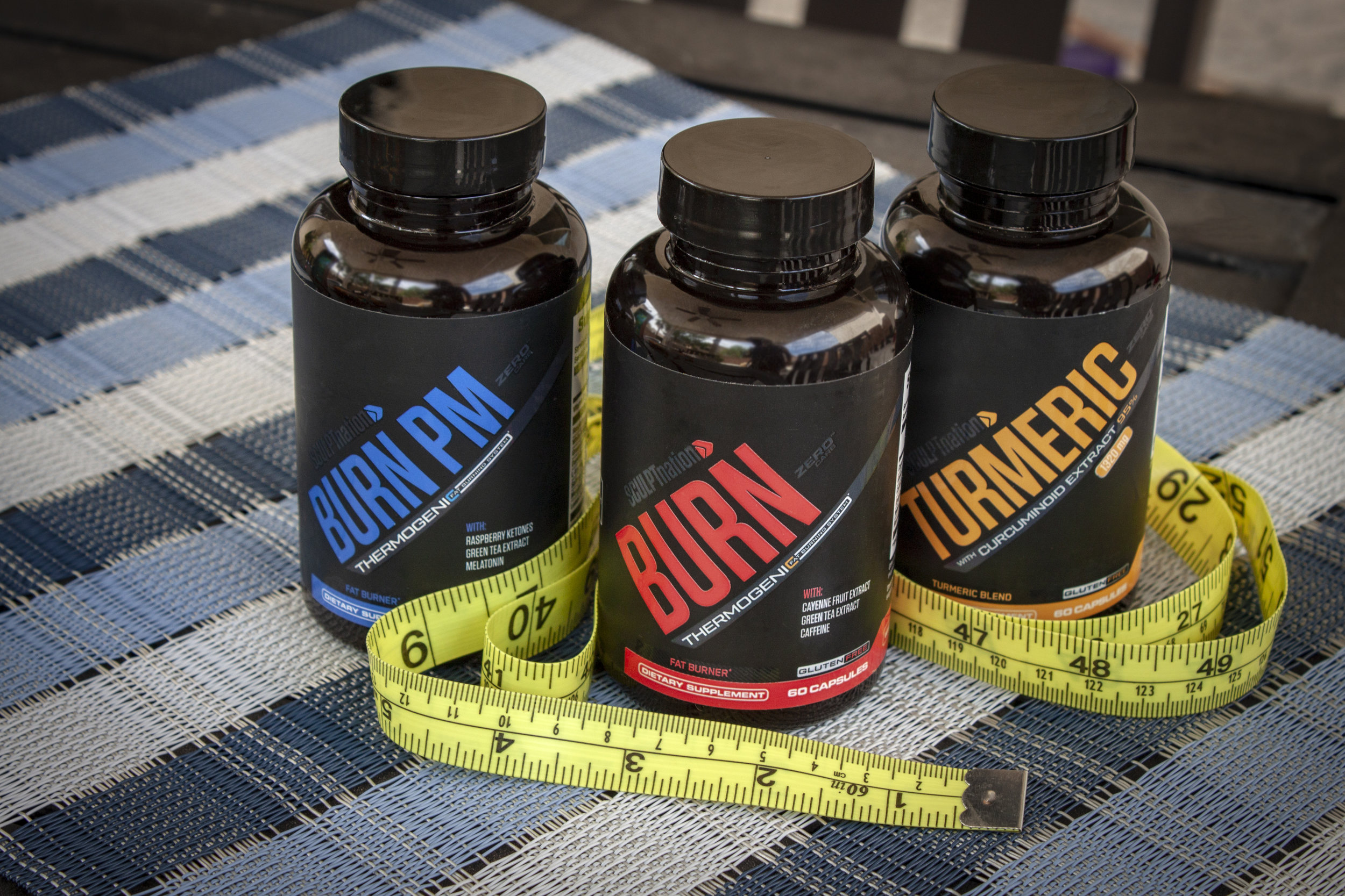
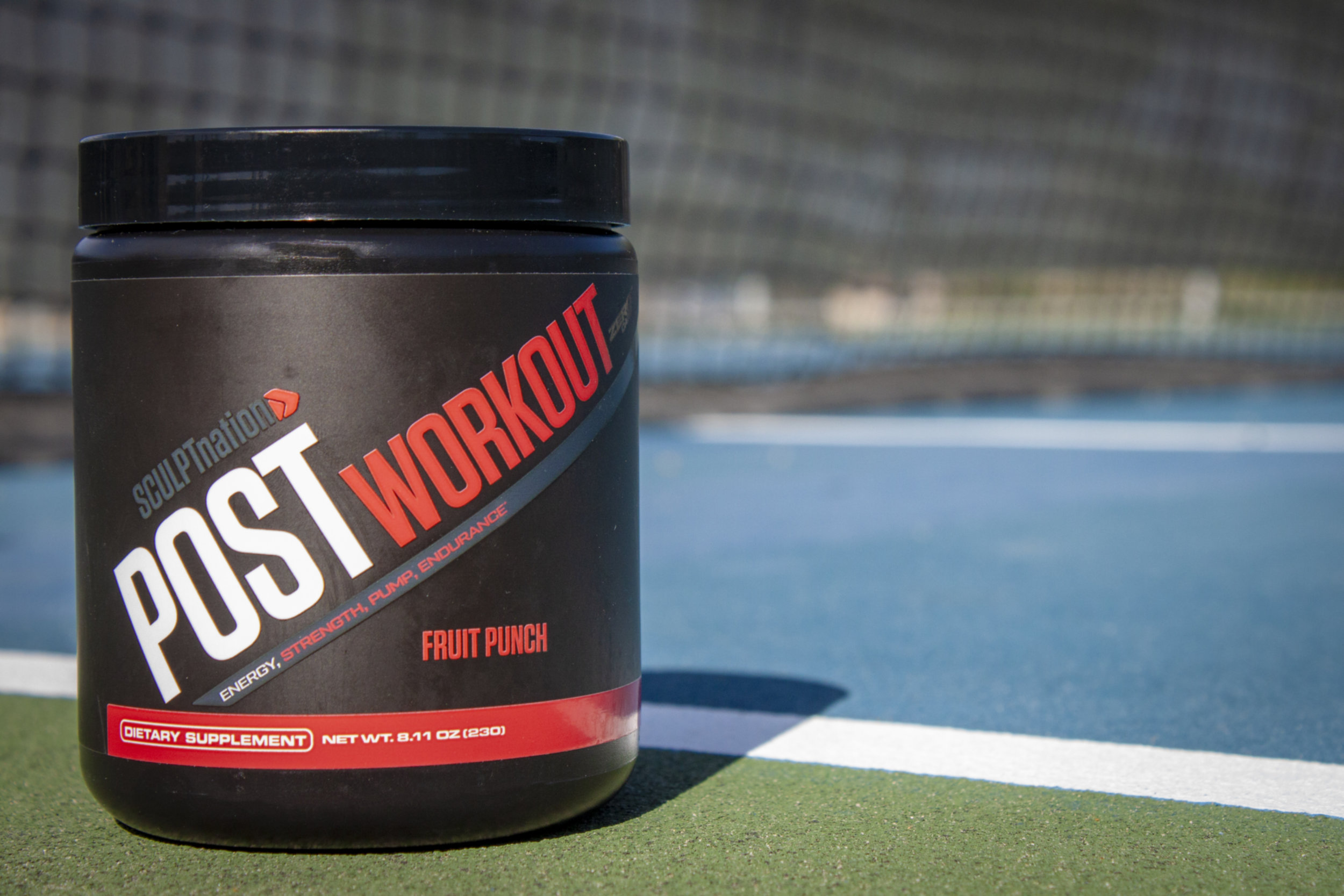
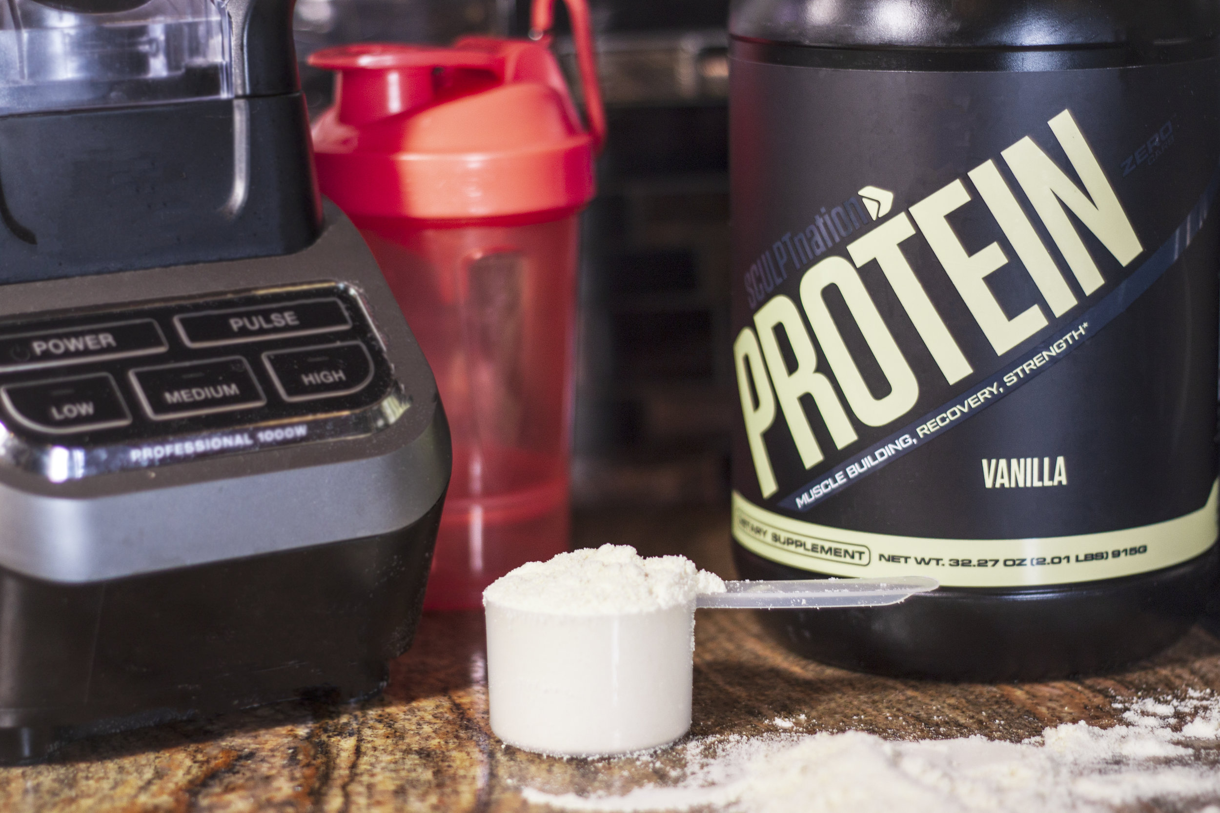
Product Photography - Lifestyle Images for Sculpt Nation (Vshred sister site)


VShred
VShred - Sr. US Design Work
SCULPTNation.com Homepage redesign
Created Homepage template & designed all sections below the header and above the footer.

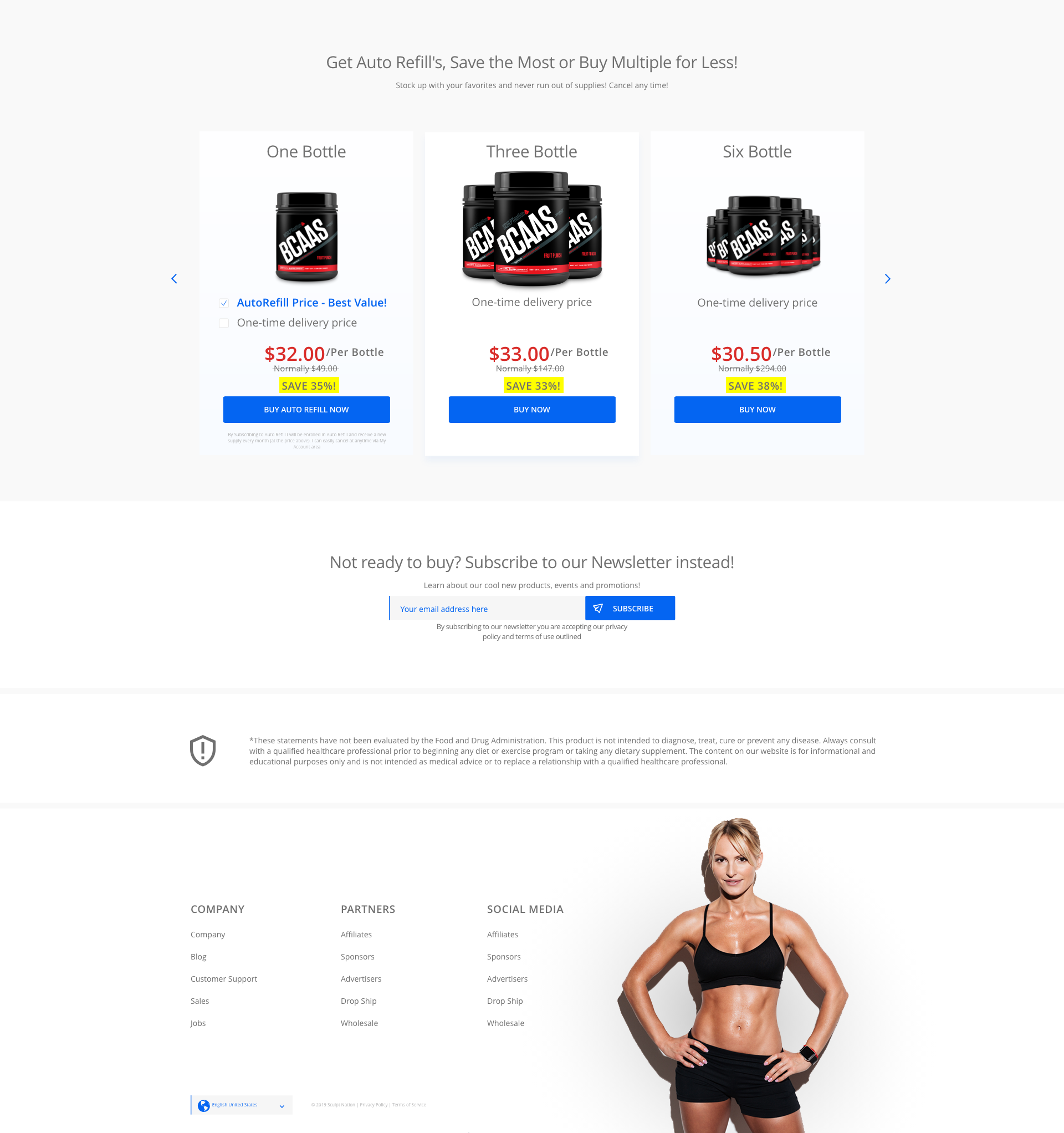
Subscriptions
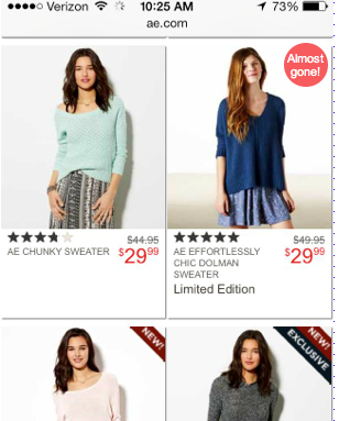
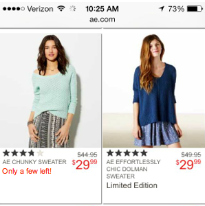
Redesigned subscription services section - to be placed on homepage and product pages. Improvements: focus on current selection to let user know which is selected, removed extra content that cluttered the image, placed in more intuitive order (was 1, 6, 3), and highlighted savings- per owner request.
Print Catalog Wireframe

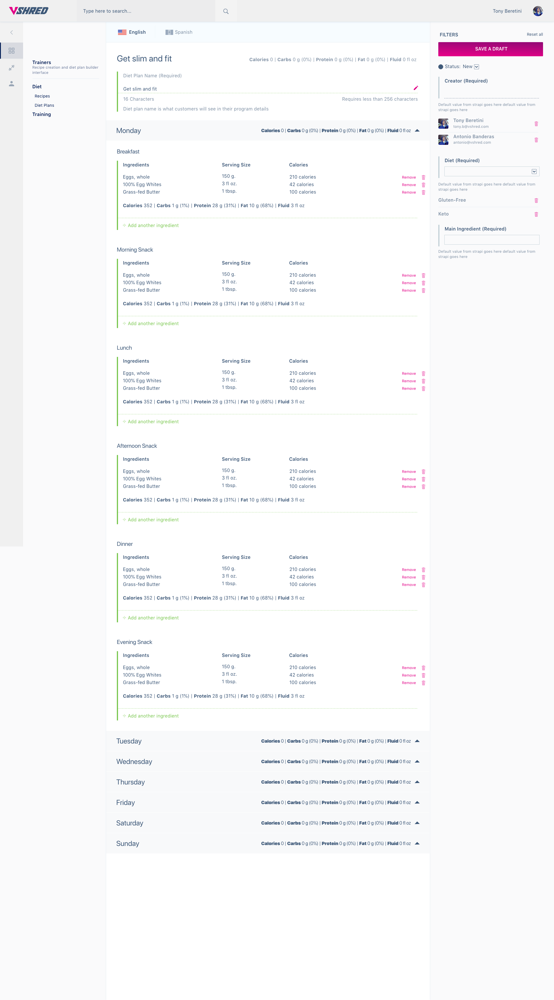
Internal Backoffice Wireframe for MENU BUILDER
Problem solved: Trainers needed a clean way to build menus for their clients. Currently they manually build PDFs. This option will allow them to decrease time spent on menu creation, as well as edit quicker to reduce edit times when a menu needs to be changed.

Skeleton Pages

Tablet Login to Back Office
UX Audit - MVP redesign

Print Catalog Design


Nevada Updates
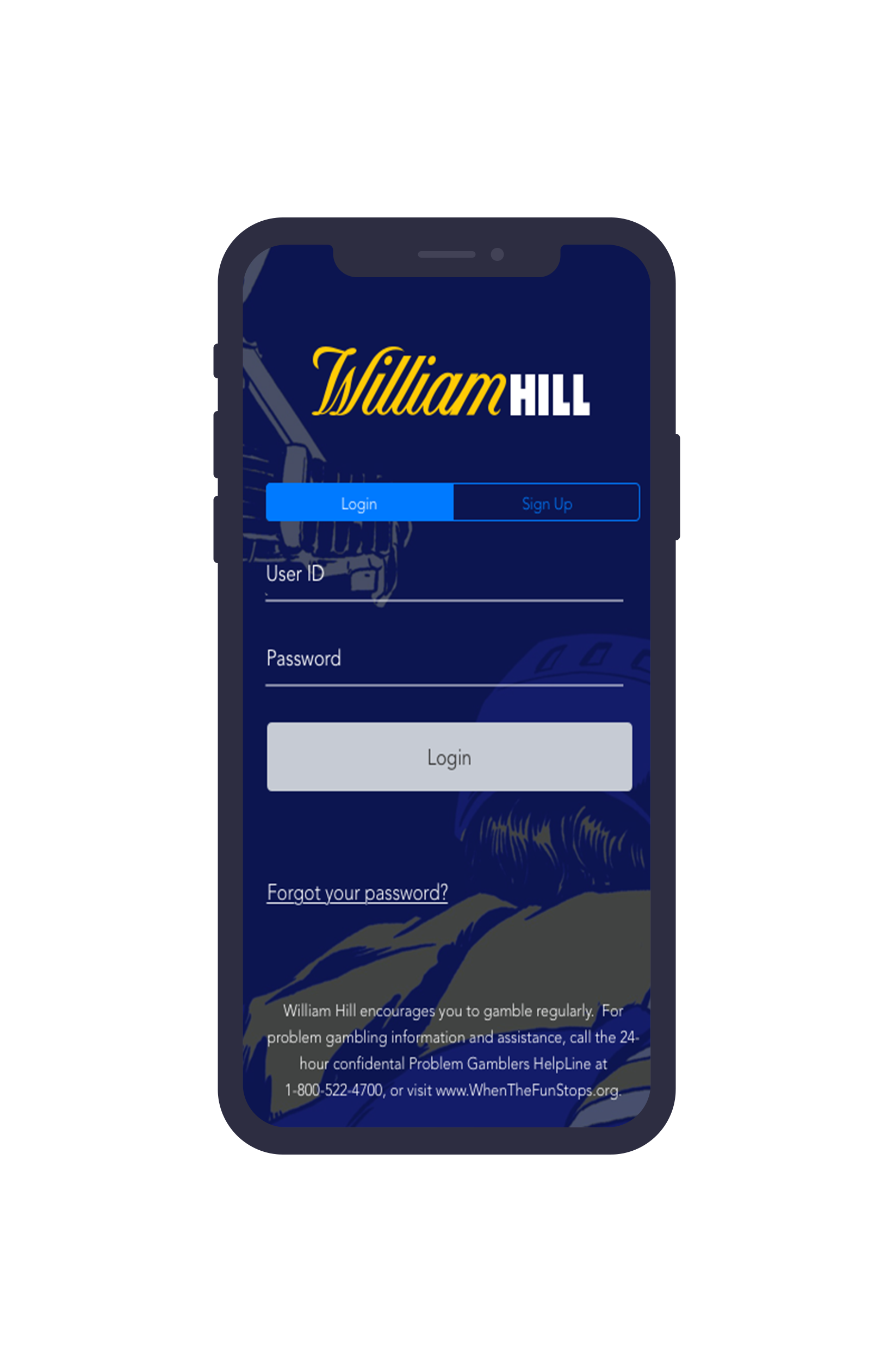
Nevada App Login
UX/UI and branding refresh
Login Screen
Left: Old Design
Right: Refreshed Design

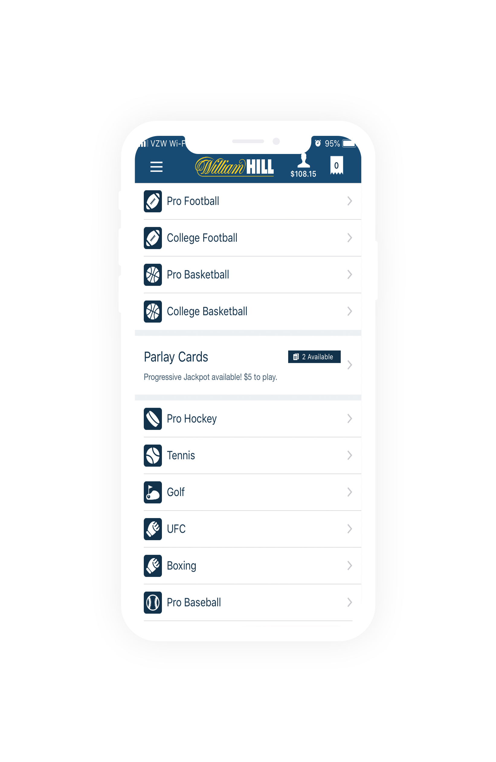
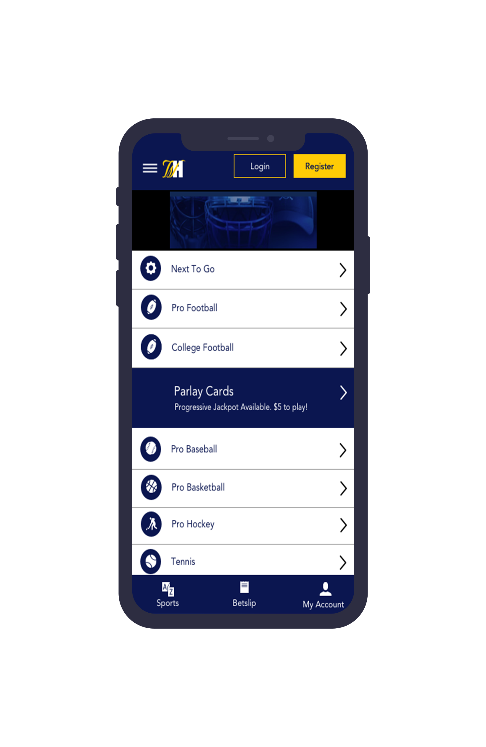
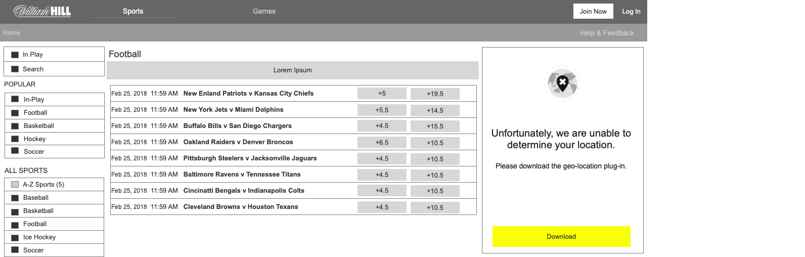
A-Z Sports
Left: Old Design
Right: Refreshed Design
Account History
Left: Old Account History
Right: Updated Account History


Deposit Kiosk Login Redesign
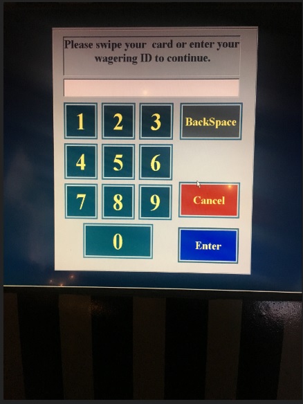
Old Deposit Kiosk Login

Updated Design Proposal (Purchase or replace stock image) - image overlay with opacity, updated logo and brand colors

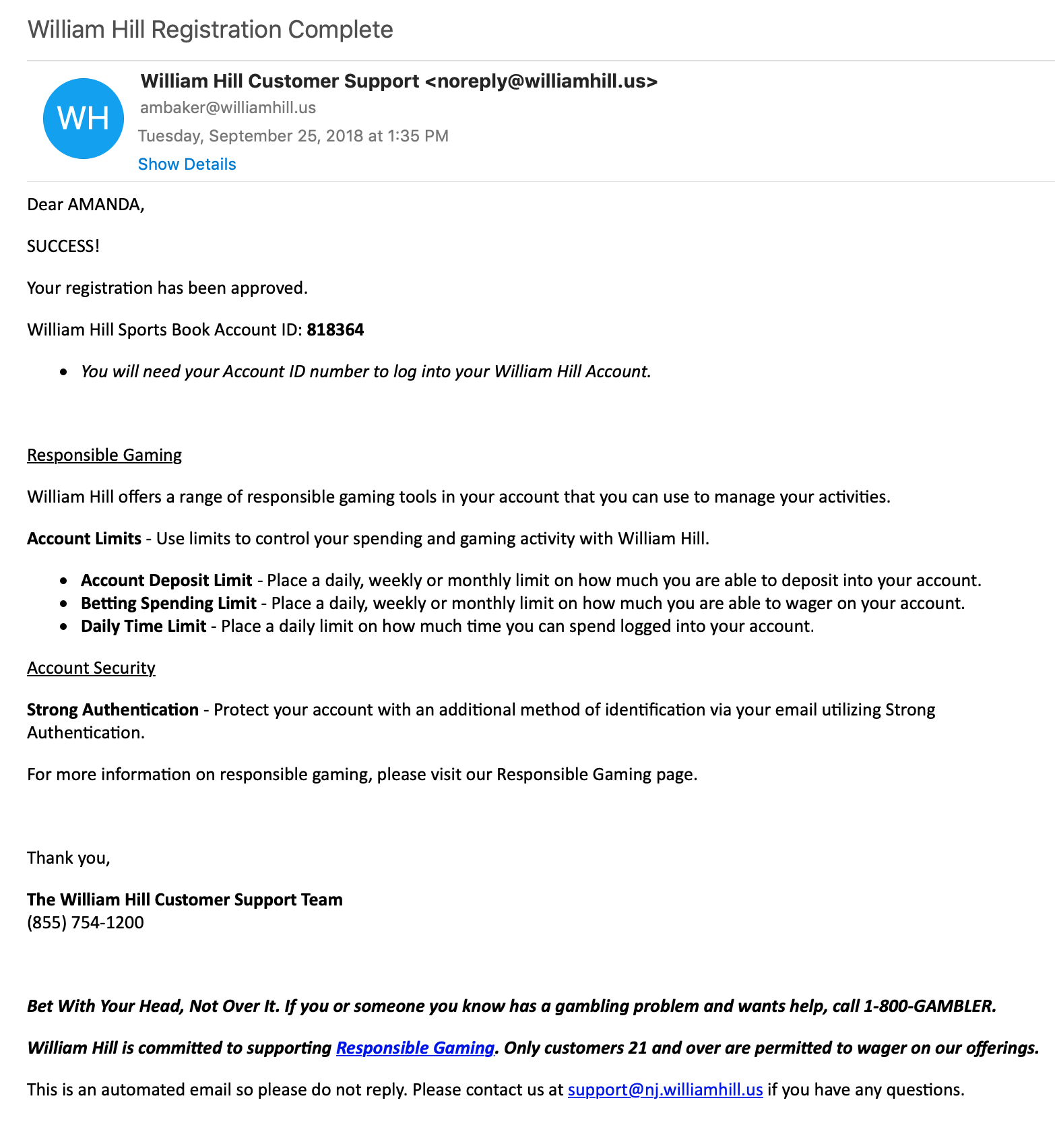
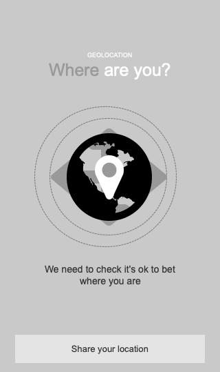
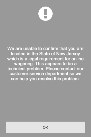
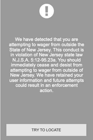
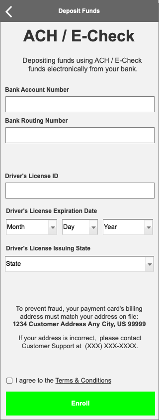
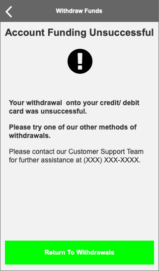
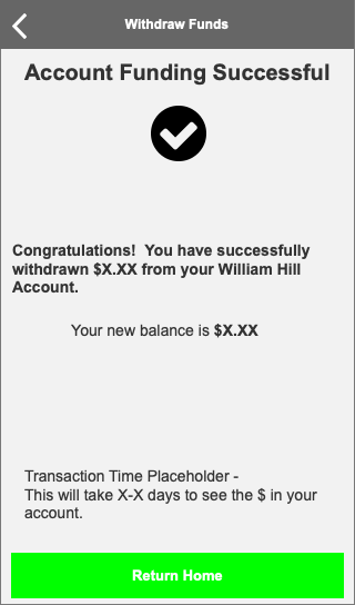
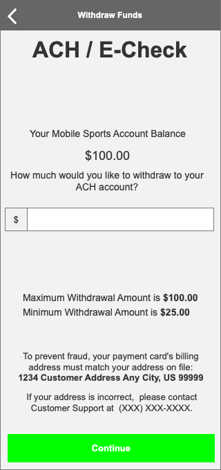
New Digital Products - William Hill
William Hill New Jersey Gaming Site/ App/ Kiosk
Competitive Analysis, Wireframes, Interactive Prototypes
Responsive Website, Native iPhone App, Native Android App, Native Kiosk App
Challenge:
The US Supreme Court overruled the decision on PASPA, making sports gambling legal across the United States. William Hill, the leading Sports Gaming company in Nevada (and a major contender in London and across the world) was tasked with creating all digital products for the New Jersey launch. Each of the user touchpoints also must meet state regulations.
Process:
Competitive Analysis
Stakeholder Interview
Low-Res wireframes
Hi-Res wireframes
Usability Testing
What was Created:
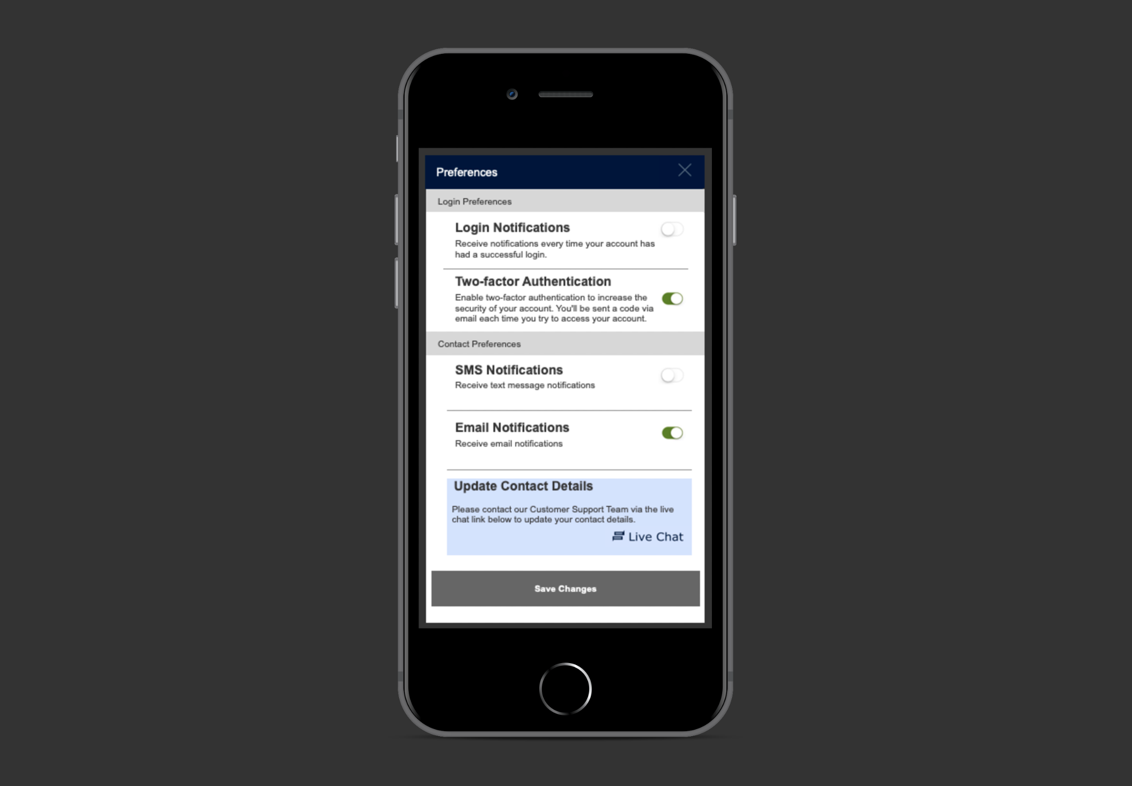
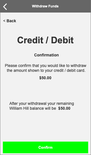
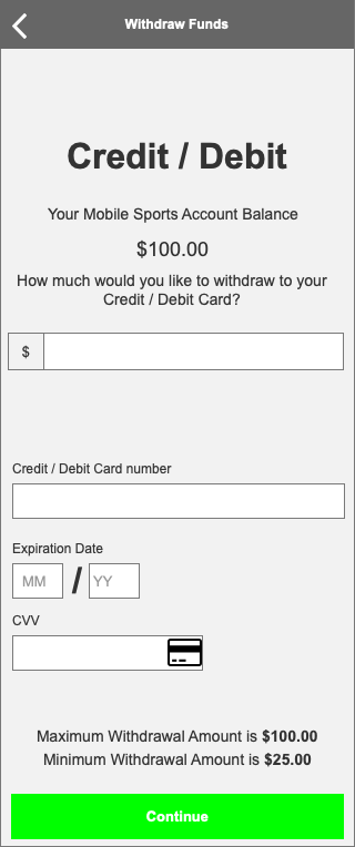
Account preferences
Mobile
Email Templates
Bet Receipt
Email Footer
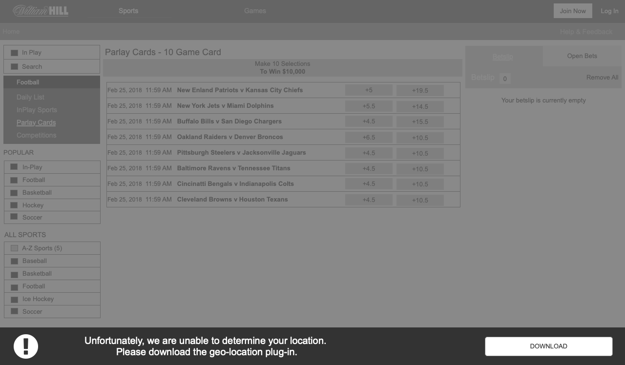
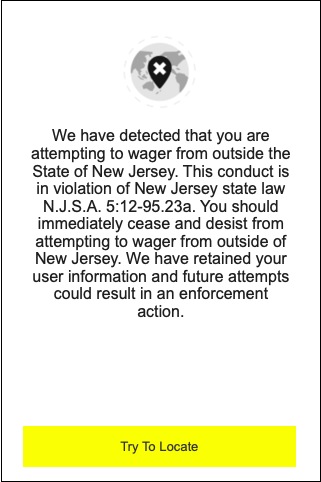
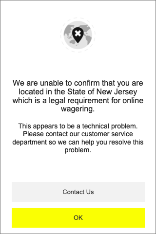
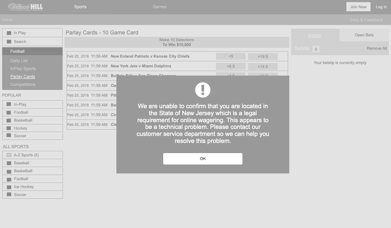
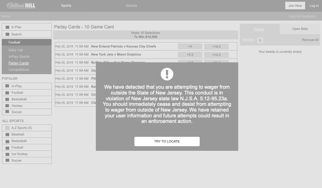
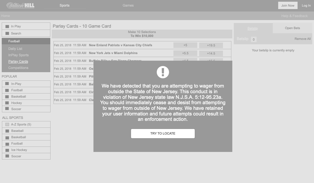
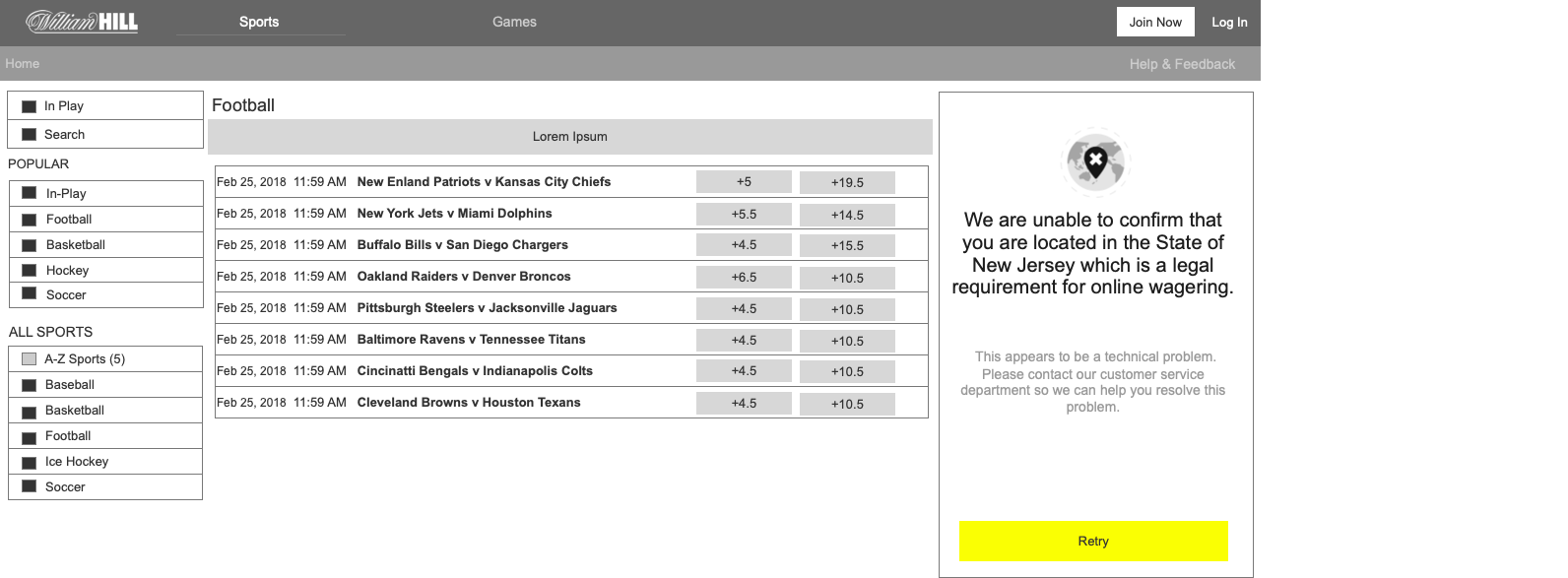
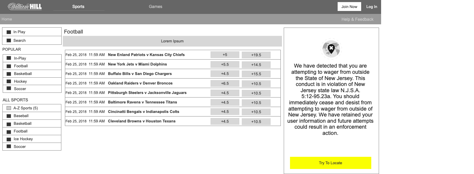
Geolocation
Self-set gaming limits
Login
Parlay Card
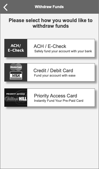
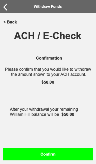
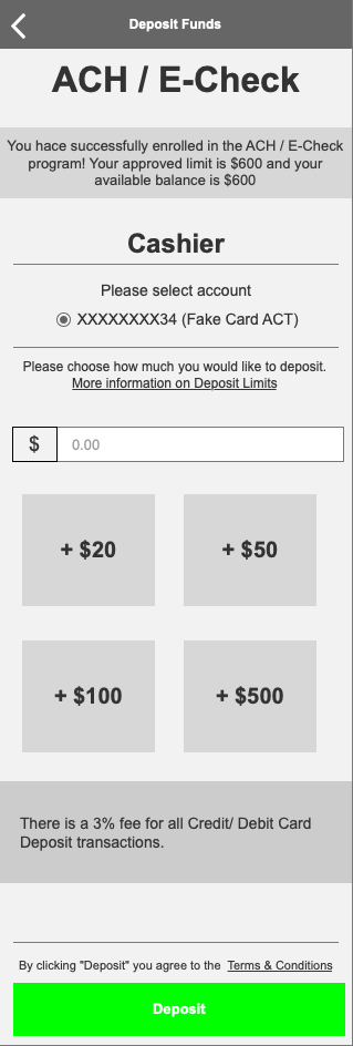
Payments
Registration
Self Exclusion
Cool Off Period
Tooltips
Deliverable Examples

Usability testing
Notes From testing
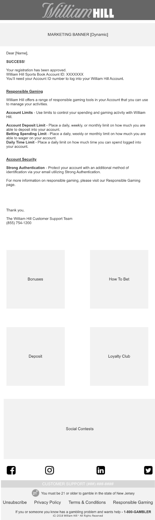
Welcome Emails
I was tasked originally with creating an HTML template for Welcome emails. However, our system had limitations in DAY 1 release for NJ that only allowed system emails to be text.
To the left, you’ll see the original low-fi wire for the welcome HTML email. To the right, you’ll see the actual non-HTML email that is in production.
Geolocation Wireframes (Desktop + Mobile)
Payments Wireframes

ENTERPRISE SOFTWARE WIREFRAMES/DESIGN
William Hill
Global Trading Platform (GTP) - William Hill
International Trading Enterprise Software
Stakeholder meetings, Wireframes
Enterprise Software Solution
Challenge:
With the addition of New Jersey and several other states into the US gaming market, the software that the traders utilize to update games into the system with odds is outdated. Each game as it currently is built has to be manually input for each state. The business asked the development team for a solution, and we created the team mapping, category mapping, and trading content sections of the site to assist traders with their process.
Process:
USABILITY TESTING
Stakeholder Interview
Low-Res wireframes
Hi-Res wireframes
Team collaboration
What was Created:
GTP Category Mapping rules engine
GTP Team Mapping rules engine
Trading Content message center

sketching
GTP - Category Mapping Rules Engine

paper wireframe
Team Mapping - GTP
The development team (front end and back end), trading team, and myself conducted several collaborative sessions where we discussed the needs of the traders in this software. I sketched several rough drafts for collaboration with development.

Wireframe
Trading GTP Platform
Paper wireframes were approved, and I began building out 2 versions of the software in wireframe format. We narrowed it down to one choice based off of ease-of-use, aesthetic, and best practice.

High-fidelity wireframe
Trading Platform - GTP
Full-color comps were delivered to front-end development. They utilized the design and we collaborated for a few small enhancements that became clear after development was started, and the product is due to go live in 4 sprints.

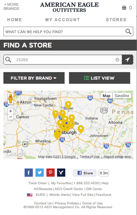
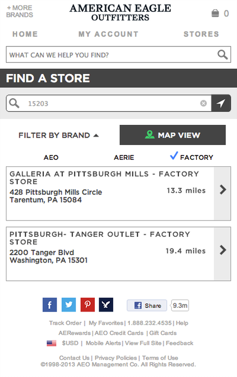
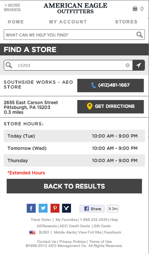
FIND A STORE
American Eagle Outfitters
Find A Store - AEO
American Eagle Outfitters Store Locator
Competitive Analysis, Wireframes
Desktop, Mobile Web, iPhone App, Android App
Challenge:
AEO was in need of an updated store locator on both desktop and mobile web. Before the competitive analysis, I already knew that I had several problems to solve. There was no way to single out AEO-owned stores (such as Aerie or Factory). There was also inaccurate hours during the holidays due to the way that the previous locator was designed. Future iterations were to include individual store pages.

Process:

- Competitive Analysis
- Stakeholder Interview
- Low-Res wireframes
- Hi-Res wireframes
What was Improved:
- Filters for properties (AEO, Aerie, Factory)
- Store Indicators adhere to design standards
- CTA button design upgrade
- Mobile-optimization
- Directions to stores
- Extended & holiday hours
- Future iterations were to include individual store pages

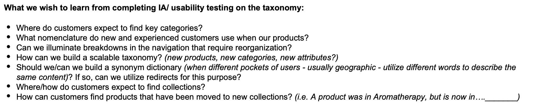
INFORMATION ARCHITECTURE
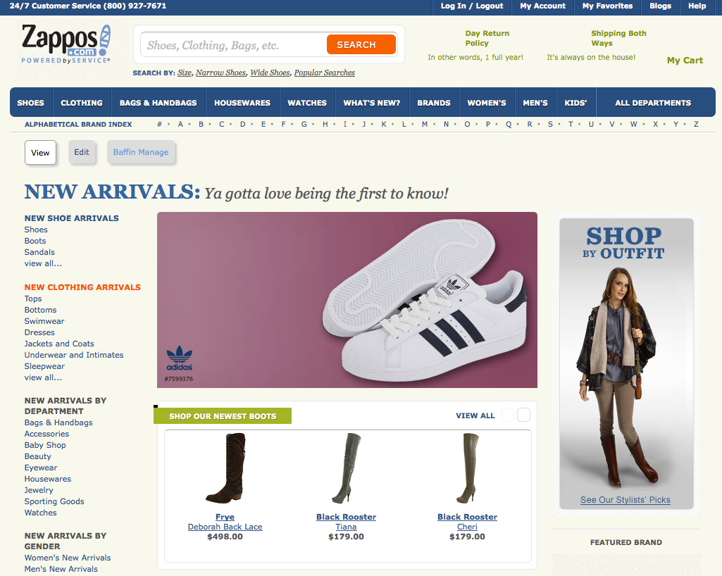
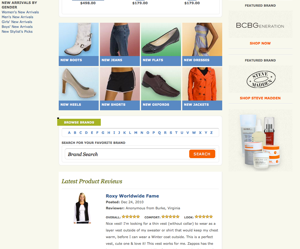
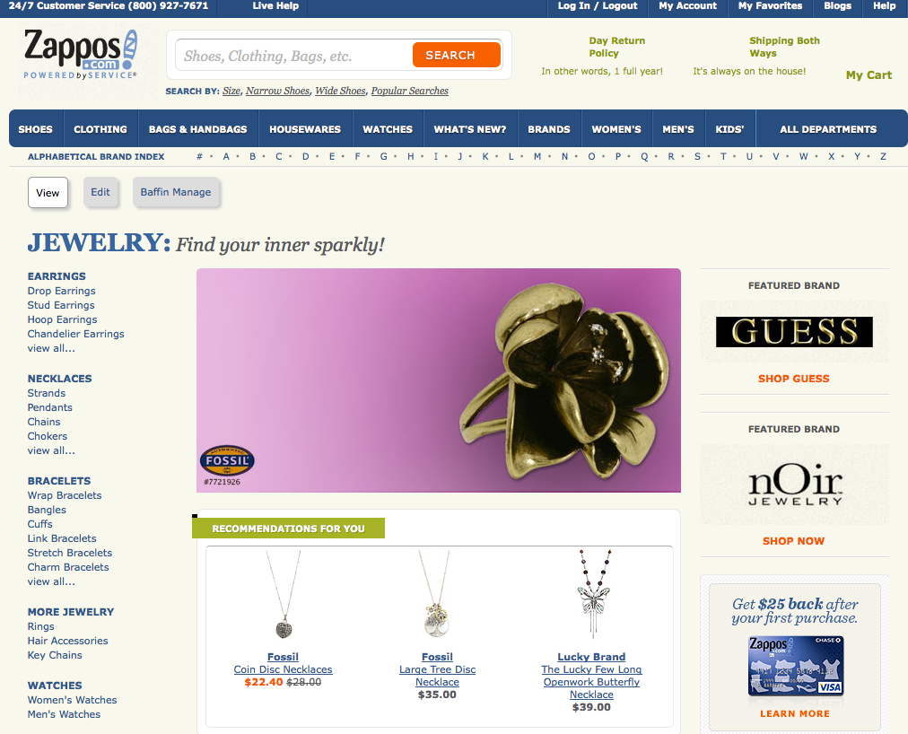
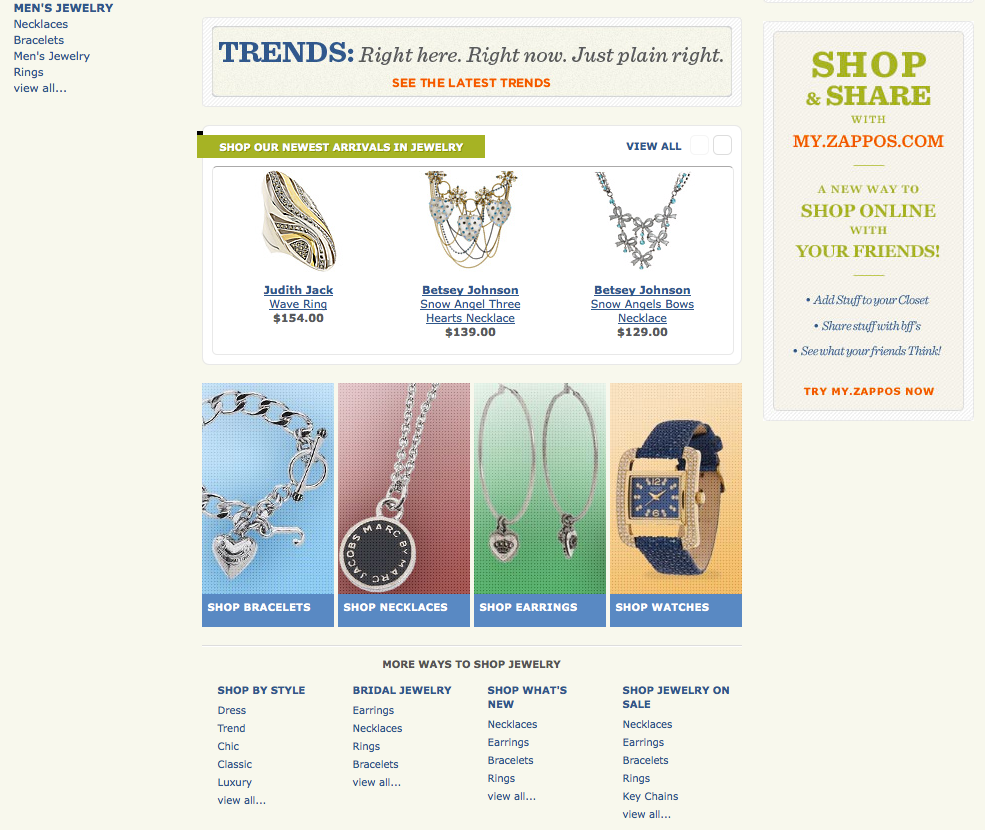
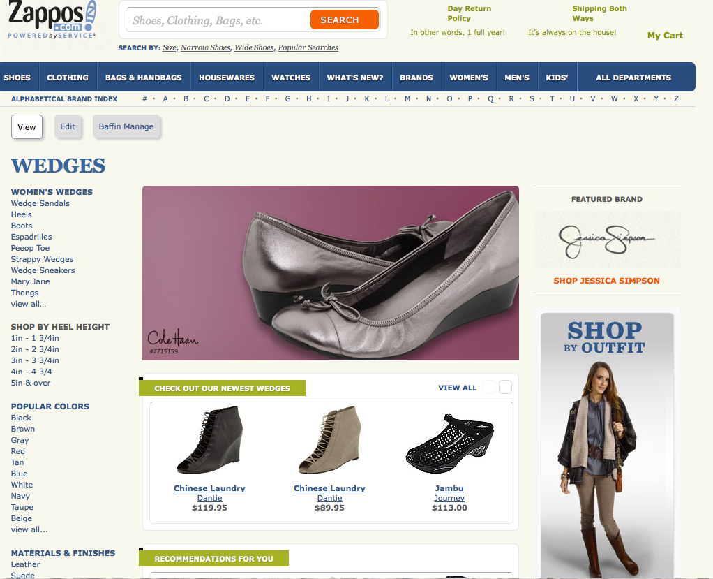
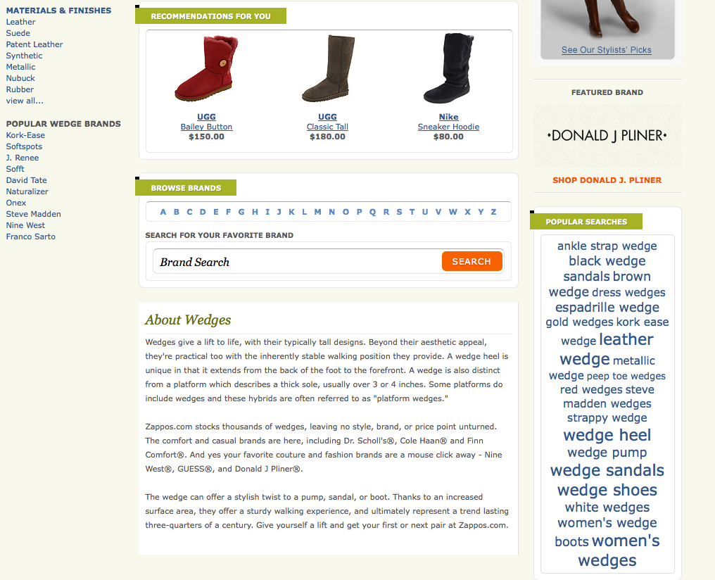
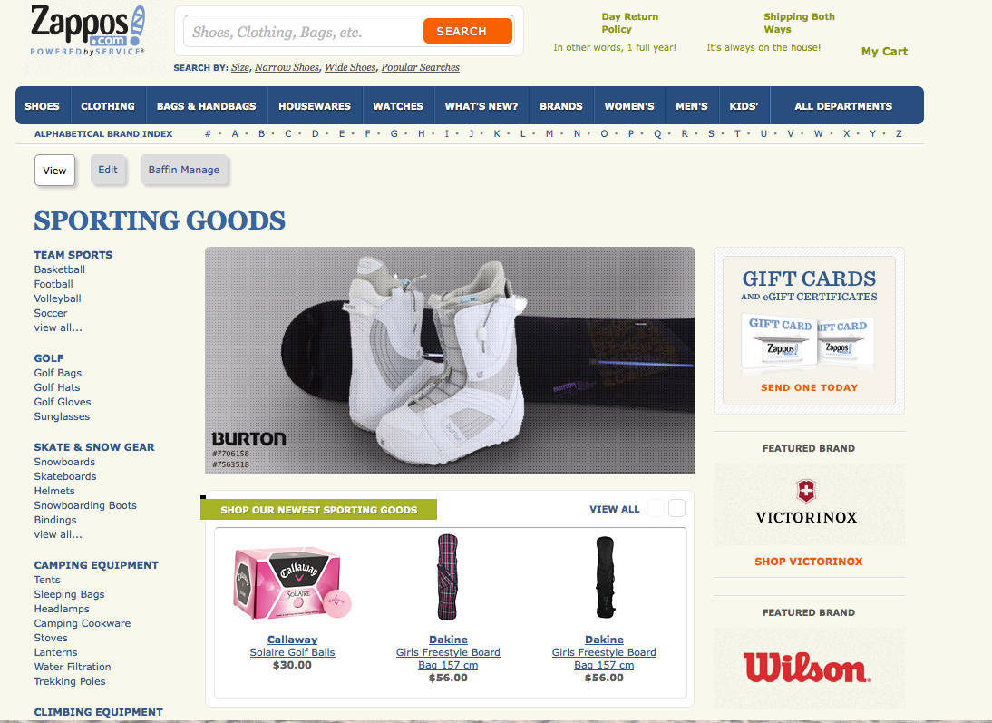
Zappos
Information Architecture
Taxonomy Form
- Advanced Landing Page Creation (Baffin) & Homepage layout
- Taxonomy
- Faceted Navigation
- Site Merchandising

Card Sort
Process:
- Competitive Analysis
- Analytics review
- Drupal/ Baffin CMS
- Card sorting
- Usability Testing
- A/B Testing

MARKETING
Edlen
Marketing -Digital, Print, In-Person Experiential
- Branding
- Logo Usage
- Style Guide
- Brand Voice
- Press Releases
- Graphic design
- Social Media creation
- Publishing
- Banner Ads
- Print Advertising

Logo Usage Guide - Social Media Style Guide


OTHER PROJECT SNAPSHOTS
AEO - Password Reset Flow
Competitive Analysis
- Wireframes
- User Stories
- Error Message studies
- Error Message re-write
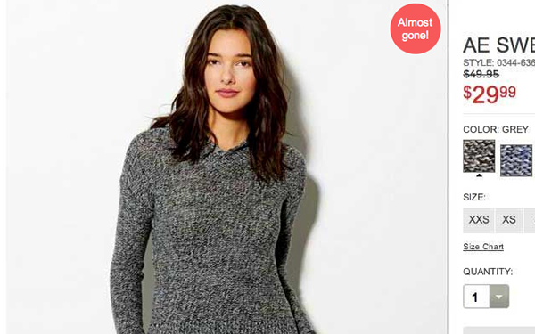
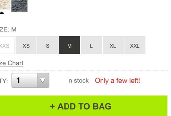
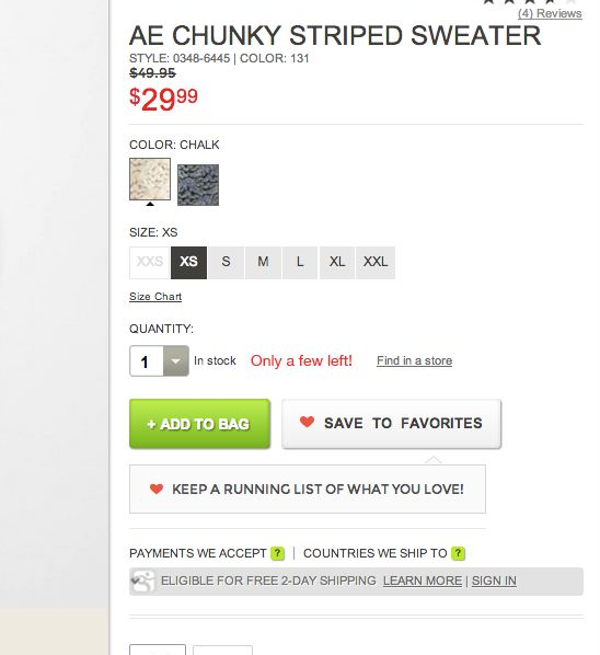
AEO- Low Stock - Sense of Urgency
AEO - Quick View A/B test

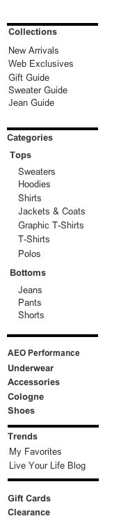
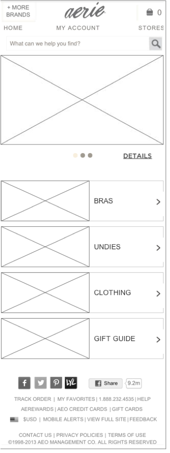
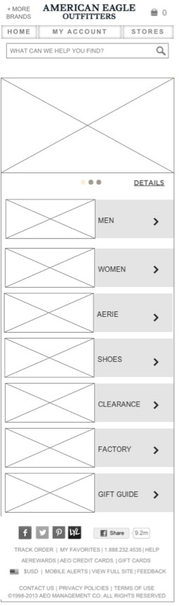
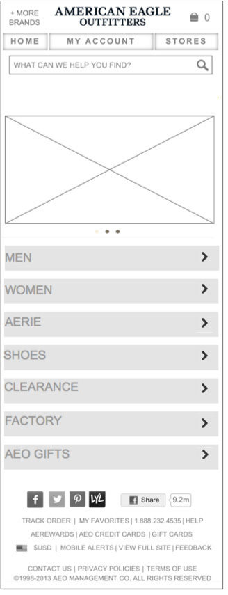
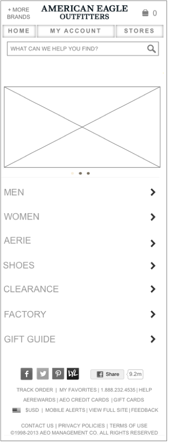
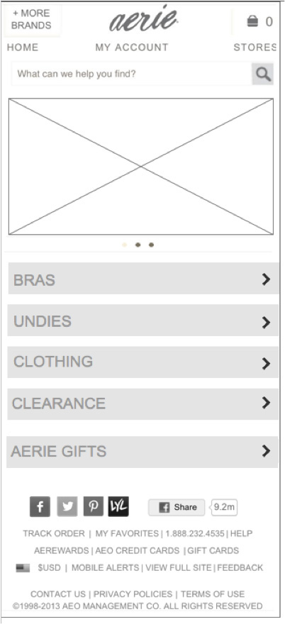
AEO Navigation
Dick's Sporting Goods
Product Page Wireframes

Product Page wire
Redesigning the Dick's Sporting Goods product page started with a focus on the image. We A/B tested various elements on the page. This is an early artifact.
Taxonomy Research Plan
Bath & Body Works as a company has a very strong category offering. They are well known for their candles and body sprays, but they sell many items beyond this.
As a focus on omni-channel increases, Bath & Body Works was looking to learn how to increase findability of products on their site.

There were a number of items that we wanted to learn, and so we mapped those out prior to running the research efforts.


We have just completed Taxonomy research and are preparing to collaborate on the final learnings.
Bath & Body Works - BOPIS SMS Opt In

What was the Challenge?
Bath & Body Works noticed a low amount of customers who were opting in to SMS Sign Up for BOPIS orders. Statistically, customers who sign up for BOPIS SMS Opt In pick up their orders significantly more than those who do not provide a telephone number and opt in.
When I first researched the reason why customers were not opting in, there was a very obvious reason. The Opt In (which is in the Billing Page of Checkout) was not very visible. The customer had to click on a check box to reveal the SMS Opt In form field, and click on a legal box after entering their number.

Test Results and new design wireframe that was tested.
How did the design do?
While this design was being completed, we finalized the implementation of A/B testing software. I requested that this SMS Opt in work be A/B tested against the existing design to ensure that the new design would work better than what exists.
The results were clear.
There was no negative affect on conversion
The SMS Opt In Rate went up significantly + 93%